Graphic Designer of the Year
Studio zetzetzet


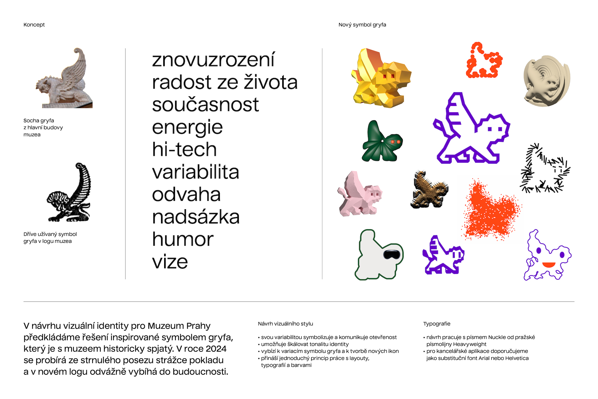
The visual identity of cultural museums has recently been changing and reacting to the new roles played by museal institutions. Apart from presenting our cultural heritage, they have also been searching for ways to open their doors and collections to a wider segment of audiences and to various leisure activities. This modernization of the museum sector also assumes a new image. The Czech Grand Design jury was glad to include the unique visual identity of the Museum of Prague – it feels fresh and instantly recognizable, while deftly working with the institution’s rich history. The zetzetzet team won the closed tender organized by the Czechdesign organization with their unique concept which consists of an unusual color scheme and riffs on the traditional symbol of the griffin, whose sculptures bracket the entrance to the museum’s main building at Florenc.
“The design was the most fitting for our vision of creating a modern city museum which produces high-tech exhibitions presenting both historical and contemporary topics. We wish to be pioneers of modern museology, and the winning visual identity will greatly contribute to this,“ says museum director Ivo Macek.
The respect for history and its symbols aren’t necessarily limitations, but rather opportunities (see, for example, last year’s nominated visual style of the State Printing Works of Securities). This is also the case mostly in the context of new media and various communications channels. The authors of the new Museum of Prague in many ways focused on movement – movement of the animation, movement towards the future, movement as representation of a living institution: “Our new griffin seems to be waking from his role as a rigid keeper of the treasure on the main building at Florenc in favor of boldly taking off and flying towards the people,” says graphic designer Mikuláš Macháček from zetzetzet studio.
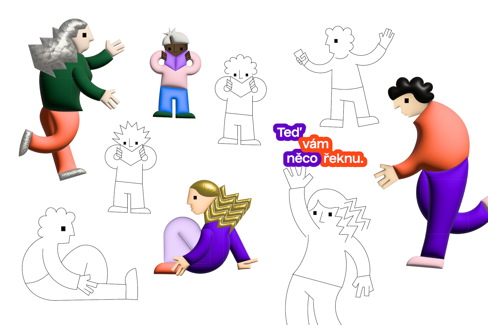
The griffin’s stylized form finds various uses in the museum’s visual identity – whether as a symbol in the logo or a figure which comes alive in motion design, the griffin changes its form like a chameleon and its outline also provides the characteristic layout of print materials. The color scheme is similarly unusual for a museum and stands out, especially in combination with the original Nuckle font, made by the Prague-based Heavyweight typesetters, which works especially well with the tracings for the main headlines.
If a visual identity’s main requirement is to be “different,” and if we’ve perhaps at times felt sceptical about the originality of possible solutions (including in the museum sphere), then the new visual identity of the Museum of Prague shows that these fears have been unfounded.
Kateřina Přidalová